L’aixpress
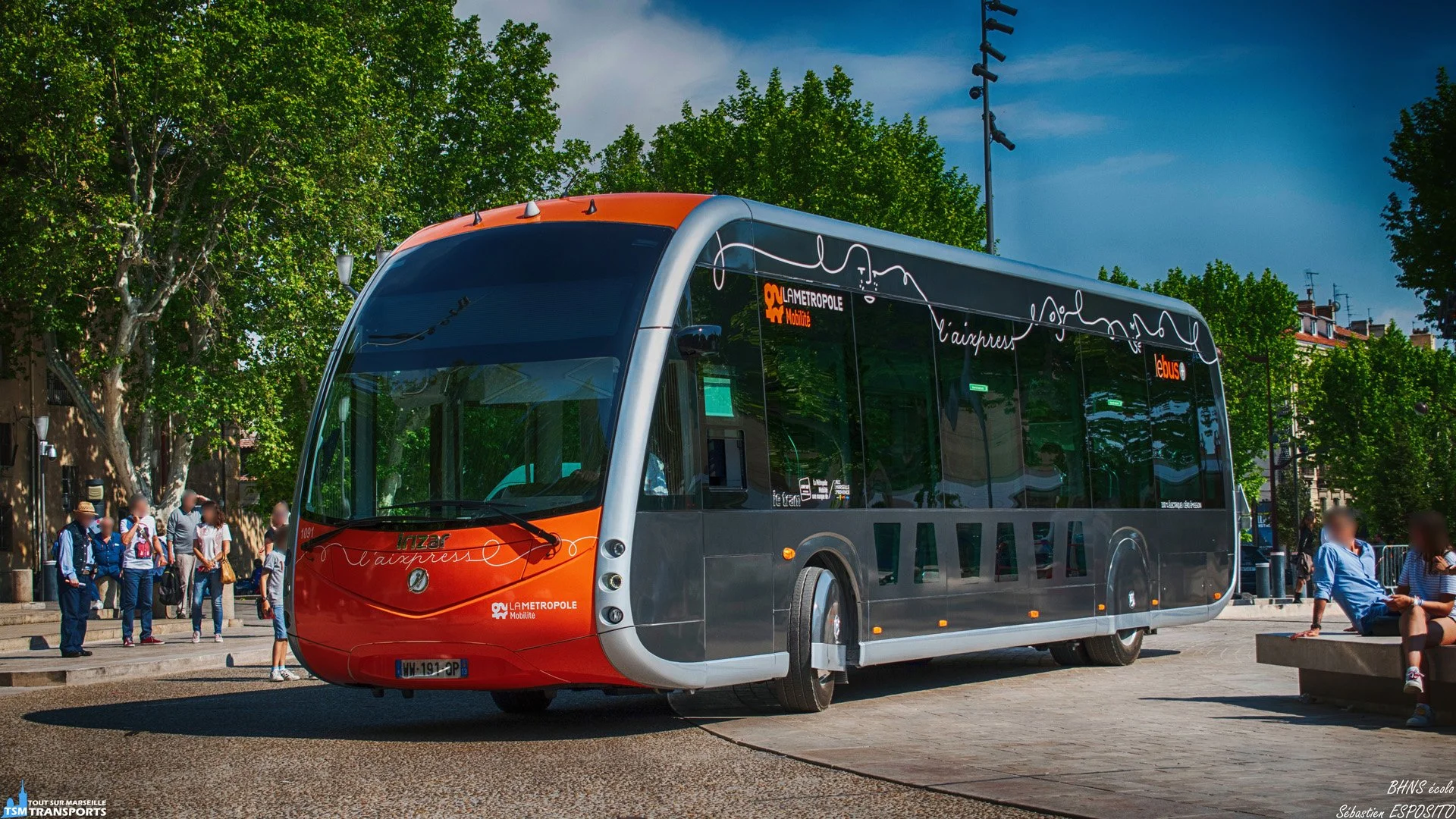
Photography : TSM & TSM TRANSPORTSL’Aixpress – Bus Design & Identity
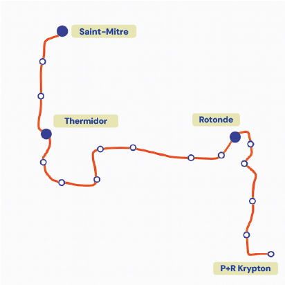
The Aixpress is a high-capacity bus line (BHNS) connecting all neighborhoods across Aix-en-Provence with a single, fluid route.
Bus line Concept
The Line
A continuous line that unites people from all walks of life, bringing together different generations and social backgrounds in the same bus, whether commuting to work, going to university, or simply enjoying the city.
Déborah Gordien, Louis Labarthe and I presented our route to the metropole transportations, and our concept was selected for the final bus design.
Objectives
Promote shared, sustainable mobility.
Create a strong and accessible visual identity.
Highlight the notions of simplicity, connection, and belonging.

Illustration suggesting the users of the bus line, in movement, linked together by the line. Illustration by Déborah Gordien. Design Approach
I developed a visual system based on a dynamic line graphic, illustrating residents, landmarks, and the idea of smooth travel.
Key elements included:
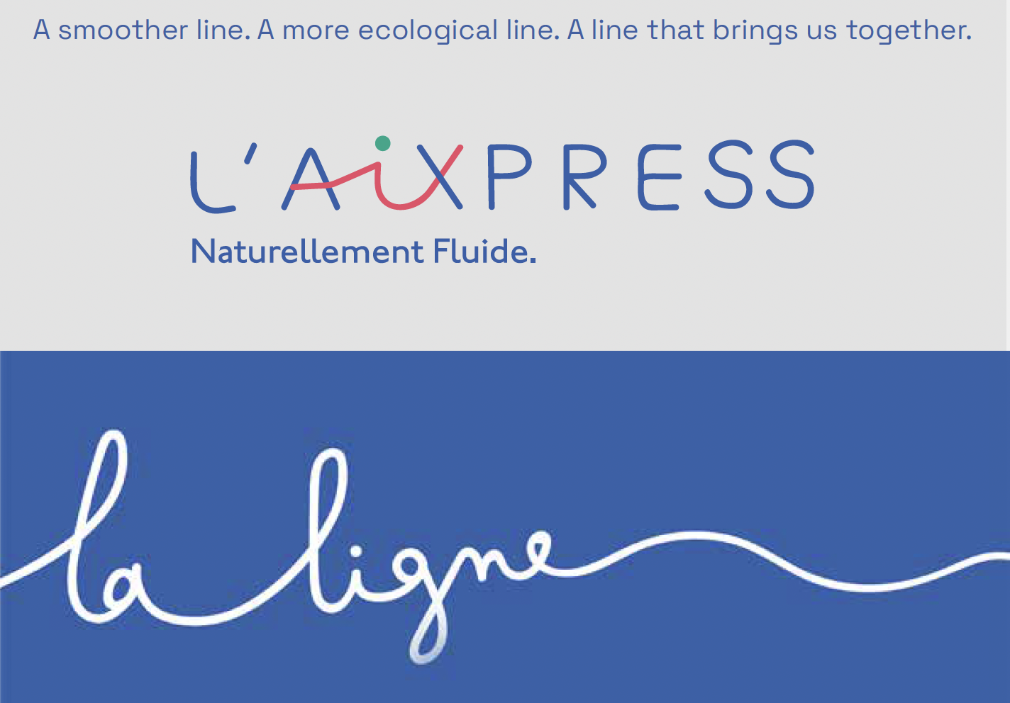
A logo combining clean typography with playful color accents (“Aix” highlighted in blue, green, and red) to reflect diversity and movement.
The tagline “Naturellement Fluide” (“Naturally Fluid”).
Illustrated patterns applied to the buses, bus shelters, and communication materials.
A contemporary color palette to ensure clear visibility and strong impact.

Bus station mock-up ↑ / Bus tickets ↓
Project Evolution
After presenting our design proposal to city officials, the Aix-en-Provence municipal graphic design team further refined the project. The color palette was adjusted to align with the city’s new brand guidelines, which had not yet been published at the time of our initial concept development.